
Roshana Care Group
Roshana Care Group is a healthcare organisation delivering aged care, disability, and allied health services. My role focused on evolving the brand to feel warmer, more premium, and more human, while maintaining trust, clarity, and professionalism across a large organisation.
Stay updated with the latest trends, strategies, and creative insights from our team of digital experts.
Project outlineJCStudio

The work centred on strengthening emotional connection through design, elevating perceived quality, and creating a cohesive visual system. The goal was to move the brand away from feeling cold or institutional and toward something more considered, supportive, and premium in tone.
Client
Roshana Care Group
Industry
Health Care
Location
Perth, Australia
Timeline
Feb 2025 - Dec 2025
Print marketing
Visual identity
Digital markteting
Branding
The existing brand lacked consistency and emotional warmth across print and digital assets. Visual execution varied widely, and many materials were not designed with scalability, accessibility, or production standards in mind, limiting the brand’s ability to feel polished or premium.
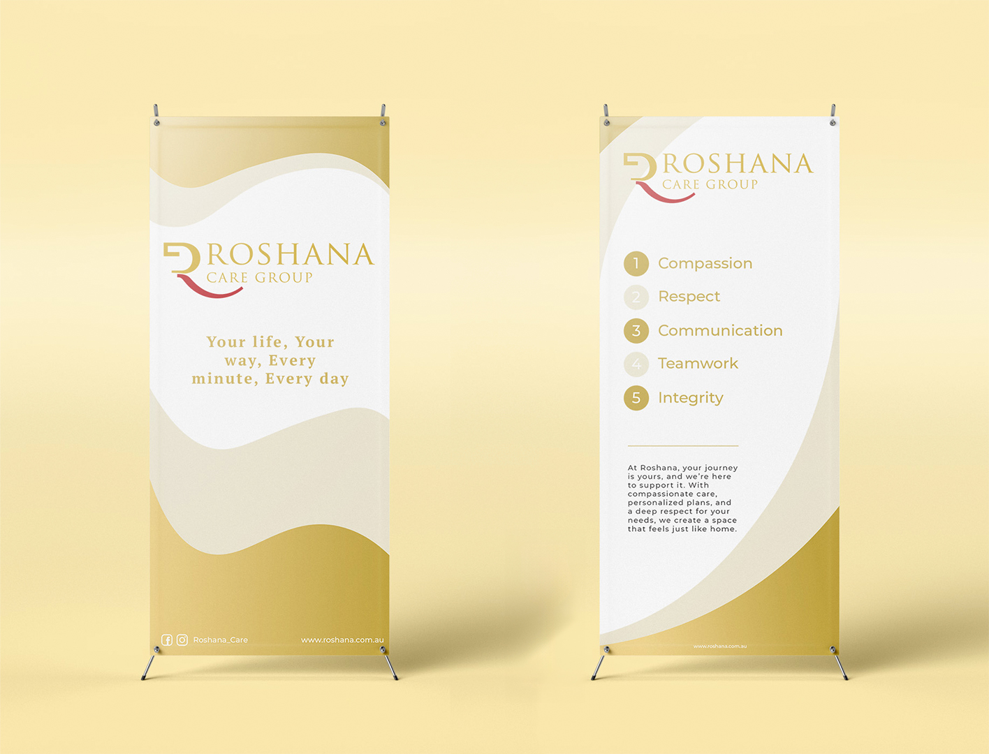
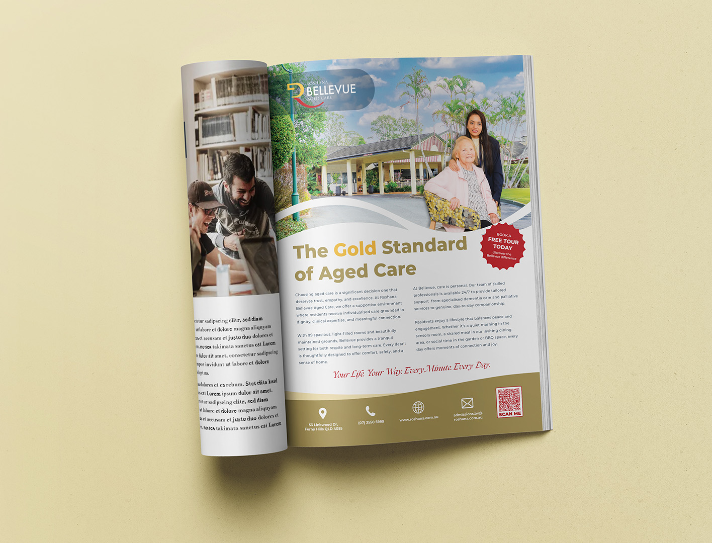

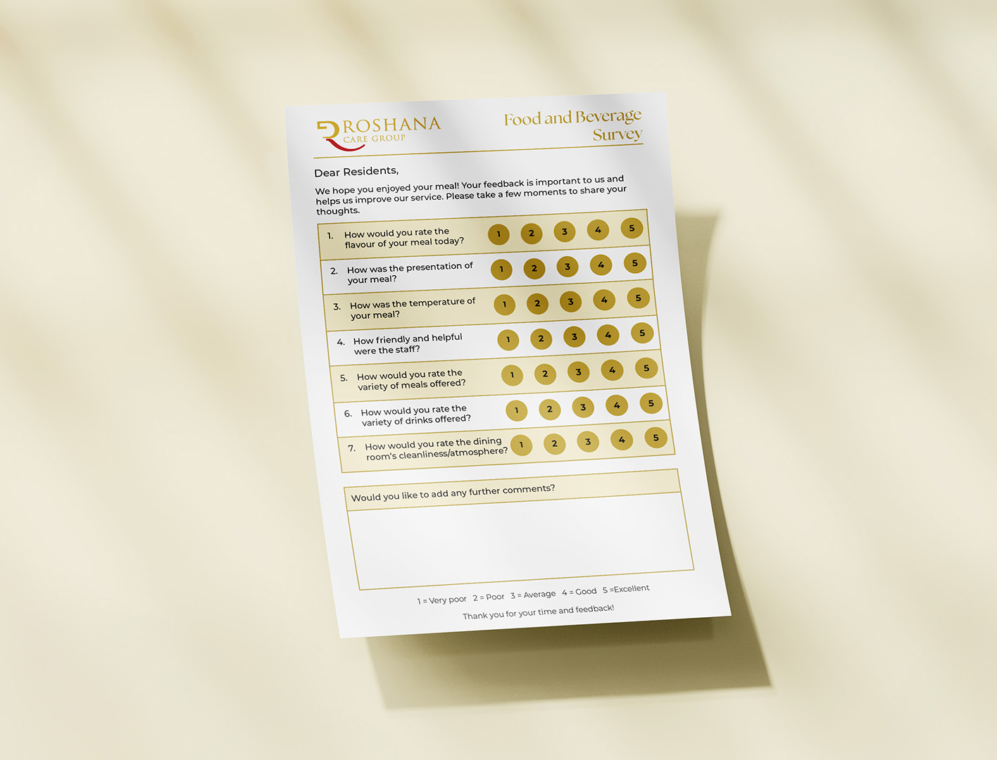
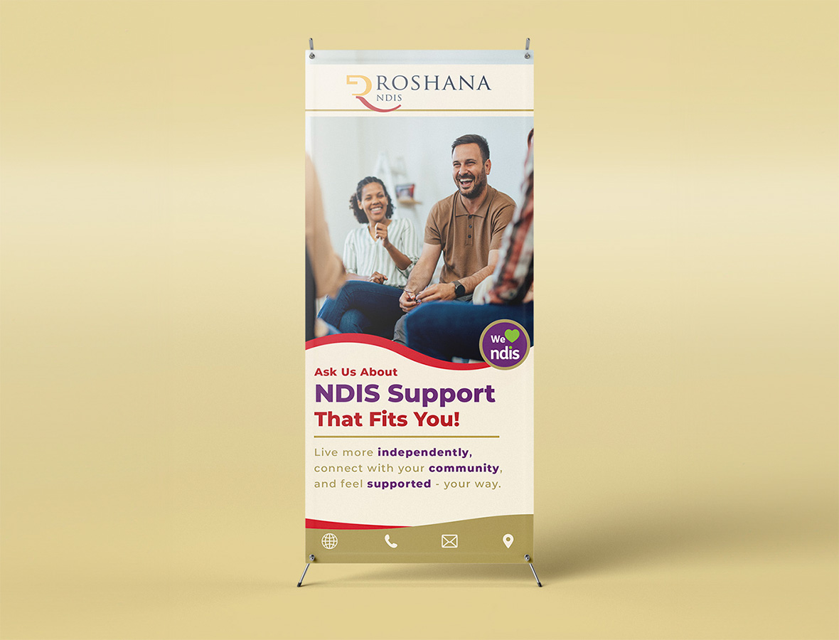

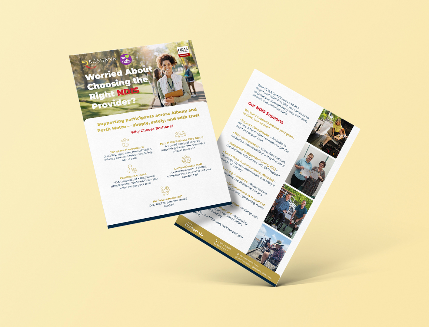


A refined visual system was developed to bring consistency and quality across brochures, signage, digital assets, and internal communications. Design decisions focused on hierarchy, legibility, and restraint, introducing warmer colour use, clearer layouts, and more premium detailing while meeting healthcare requirements.

The outcome was a more cohesive, premium, and human-centred brand presence across the organisation. The updated system improved clarity, production quality, and consistency, providing a strong foundation for ongoing growth and future design work.