
Dorothys Dough
Dorothy’s Dough is a brand identity built from a personal starting point. My grandmother taught me how to bake, and the brand draws directly from that influence. The aim was to create something that feels familiar and character-driven, rather than relying on generic bakery visuals.
Stay updated with the latest trends, strategies, and creative insights from our team of digital experts.
Project outlineJCStudio
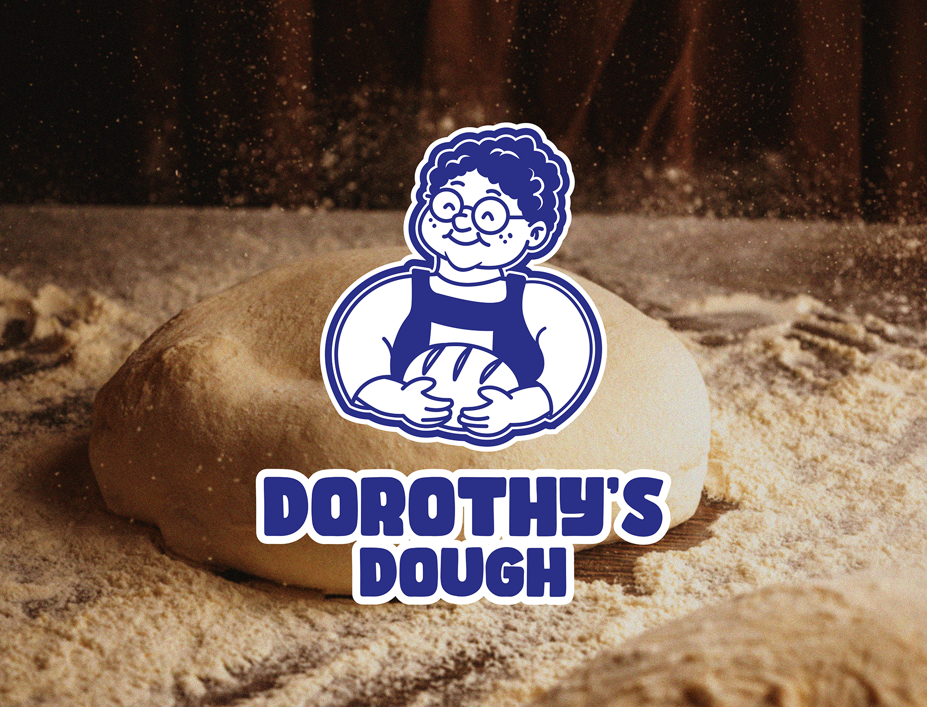
The identity centres around a recognisable character to create a sense of warmth and approachability. Each element was designed to translate consistently across packaging, signage, and in-store applications, ensuring the brand feels cohesive in real-world use.
Client
Dorothy's Dough
Industry
Bakery
Location
Melbourne
Timeline
Branding and Packaging
Wayfinding
Packaging
build
Branding, Packaging
The challenge was to create a bakery identity that stands out without losing clarity or usability. Many brands in this space either feel overly minimal or interchangeable. The goal was to avoid both, creating something with a clear point of difference that still works in fast-paced retail environments.

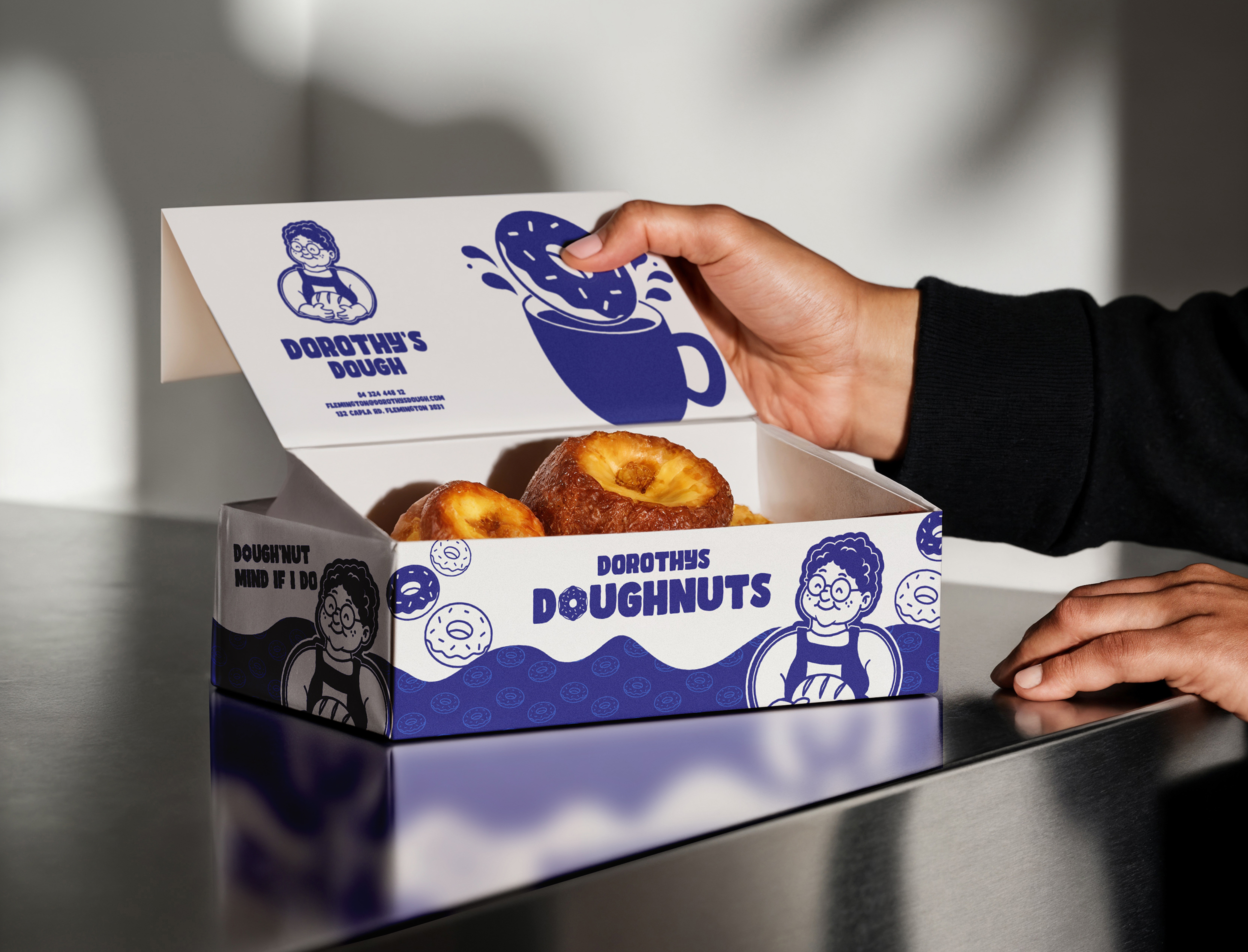


The solution was to build the identity around a simplified illustrated character, capturing personality without overcomplicating the design. This was paired with bold, legible typography to ensure strong visibility across all touchpoints. A controlled colour palette reinforces consistency while helping the brand remain distinctive.
The result is a cohesive brand system that works across multiple applications, from packaging to storefront. It maintains a strong visual presence while retaining a clear sense of personality, allowing the brand to feel both familiar and recognisable.